Using the Seventy-Twenty-Ten Rule with Color
How to use the 70-20-10 rule of balancing in color and design.
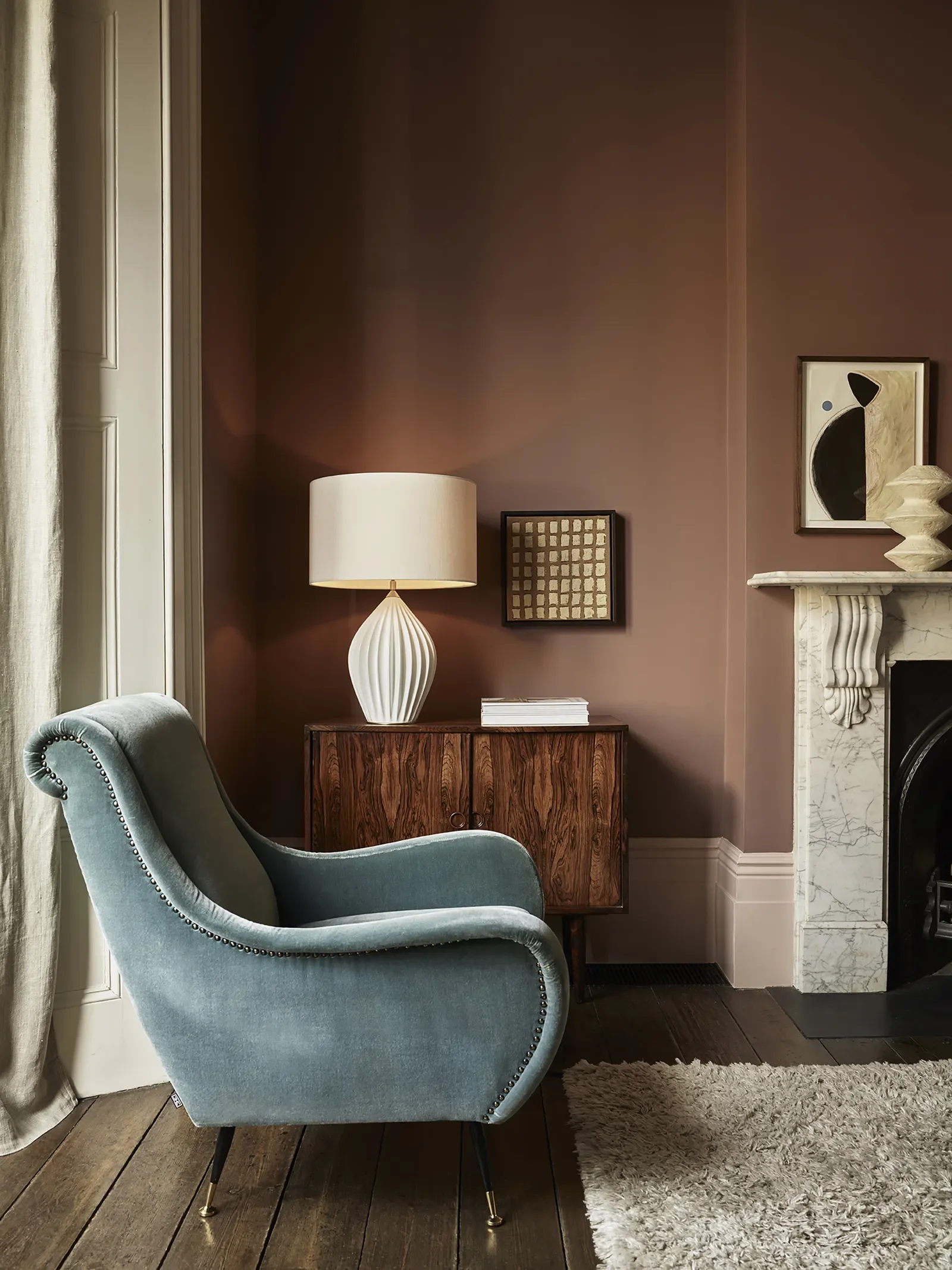
Brownish-Rose walls with Neutral Curtains and Rug.
I love color and in some arenas like creating fine art, I can go all in and out the other side. But to create a space that I find relaxing and nurturing, it needs to be serene and also interesting.
There is a concept in interior design of balancing called the 70-20-10 rule. Here it is:
Use 70% of one color in a neutral: white or warm earthier colors, for the walls and ceilings. This creates a grounding relaxing envelope that is expansive too.
Use 20% of another color for rugs and draperies or blinds. This could be a subtle difference, such as rose beige curtains with tan walls, or a contrast such as pale taupe walls and green rugs and draperies.
Then use 10% of an unexpected color for accessories: pillows, light fixtures, ottoman, decor objects and artwork. This has to be an intuitive choice, but unexpected is best: acid green, lavendar, lemon yellow, gold.
Here are some really great 70% colors I’ve worked with.
Benjamin Moore Edgecomb Gray. It's a beautiful greige that is expansive and enveloping. Looks good with many other colors including blues.
Benjamin Moore Tudor Cream. For an uplifting youthful color similar to French Vanilla ice cream, you will love this. Looks great with cool colors for a complementary contrast.
Farrow and Ball Sulking Room Pink. This is hovering between brown and rose, an amazing moody color. The supporting colors can be taupe, chocolate brown.
Farrow and Ball French Gray. Closer to a green, this works on a whole room.
Sherwin Williams Alabaster. A tried and true not too warm, not too cool white.
Sherwin Williams Universal Khaki. A wonderful color that can be used in any room. Adaptable, warm and easy to live with.
If you need help with choosing color for your interior or exterior paint job contact me through my website contact page or text 925-222-1145.
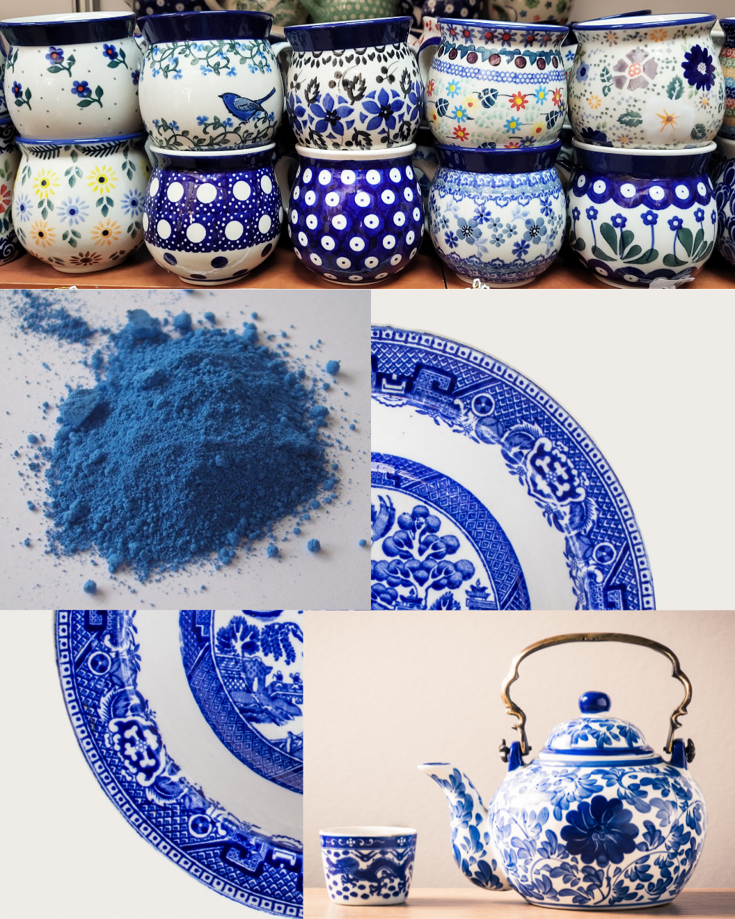
Blue and white, a classic color combination that has been used for centuries.
Blue and white decoration first became widely used in Chinese porcelain in the 14th century, after the cobalt pigment for the blue began to be imported from Persia. It used natural cobalt oxide as a pigment to draw patterns on the porcelain body, then a layer of transparent glaze was applied, finally it was fired at a high temperature of around 1300 ℃. After the cobalt material is fired, it turns blue. Popular subjects for the hand painted pottery were leaves, flowers, scenes of life.
Blue and white decorated pottery imported to Europe from China had become an important symbol of wealth in the late 17th century and by the mid 18th century thousands of tons of porcelain, much of it blue and white were being imported to Britain and other western countries. By the end of the 18th century, British companies such as Thomas Turner and Josiah Spode had caught on to the trend and were producing their own version of blue and white tableware, which was mostly transfer printed. Subjects were mainly Asian themes, with scenery and figures.
Blue and white has been a popular decorating scheme in the decades that followed the production of pottery, through using china collections, fabric prints and paint color. A modern twist would be to use the cobalt on cabinets or a sideboard. Here are some cobalt colors in different shades along with other colors that look great with them.
All colors are Benjamin Moore. Note: You can use the color’s name and number stats at other paint companies and they will mix it for you.
Champion Cobalt 2061-20
Marine Blue 2059-10, darker cobalt
Old Blue Jeans 839, lighter cobalt
Colors that go with cobalt blue:
Blue Angel 2058-70, pale blue
Pale Oak OC-20, greige for a warm contrast
Complementary to blue: orange colors
Adobe Dust 2175-40 terra cotta
Tudor Cream 2157-60, lovely very pale peach
Teacup Rose 2170-50, girly coral
Contact me for help with your interior or exterior paint colors. Use the contact sheet at www.beforeyoupaint.net or text 925-222-1145.
Sources: Natalia, China Xian Tour; Phillip Harland, Curios and Curiouser
Mid-Century Modern Design and Color
Decorating in a midcentury modern style? See this post for color choices.
The term Mid-Century Modern in decor is used a lot today. The span of time refers to either the decade after WWII, 1947-1957, or a broader period of the early 1930s to the mid-1960s.
This design style is characterized by:
Clean lines and simplicity
Both straight lines and organic curves
Defined geometric forms
The use of leather, wood, concrete and glass
The color palettes of each decade evolve and renew themselves. If you want to create a mid-century feel to your decor and to save you some time and research, here are some suggested colors for three decades of this design style, from Sherwin Williams.
1940s:
SW0065 Vogue Green
SW0066 Cascade Green
SW0067 Belvedere Cream
SW0068 Copen Blue
SW0069 Rose Tan
SW0070 Pink Shadow
SW0071 Orchid
SW0072 Deep Maroon
1950s:
SW0073 Chartreuse
SW0074 Radiant Lilac
SW0075 Holiday Turquoise
SW0076 Apple Blossom (Rose)
SW0077 Classic French Gray
SW0078 Sunbeam Yellow
SW0079 Pinky Beige
SW0080 Pink Flamingo
1960s:
SW6887 Navel (orange)
SW6910 Daisy (yellow)
SW6840 Exuberant Pink
SW6703 Frolic (Chartreuse)
SW6824 Forget-Me-Not (purple)
A guideline for modernizing these colors is to choose two that mix with other neutral wall or furniture colors in your room. They really would be too much for a wall.
For more information on furniture, architecture and typography from this era, see a beautifully-written article linked here: https://midcenturymoderns.org/history/what-is-mid-century-modern/
If you need help with your paint colors for an interior or exterior, contact me at www.beforeyoupaint.net, or text 925-222-1145.
Can my Bedroom Color help me get a Good Night's Sleep?
Hello, I was asked to contribute to a Redfin blog on getting a good night’s sleep. Click on the title below: 17 Strategies to Improve Sleep Quality for the full text. Pamela
If a good night's rest is something you can only dream of, you’re not alone. Whether you live in a home in Kansas City, MO, an apartment in Minneapolis, MN, or a rental home in Des Moines, IA, there’s a good chance your bedroom isn’t set up for optimal rest. In fact, only about half of Americans wake up feeling well-rested. Check out this Redfin article we were featured in for 17 Strategies to Improve Sleep Quality.
Farmhouse Color
Farmhouse decor has modernized, less signs, more color.
Farmhouse Decor
In 1989, Rachel Ashwell launched her brand Shabby Chic. This became a groundswell in the decorating world because it was an achievable, soft, affordable way to decorate your home that uses thrifted items, vintage linens, floral prints, chipped unmatched furniture and mostly white with soft colors. She still likes soft color but uses some smoky colors.
The second big farmhouse influence is Joanna Gaines’ Magnolia Company. Her show Fixer Upper launched in 2013, and as it took off she became an easy to follow template for a very liveable style. Second hand chipped furniture, iron bedsteads, advertising signs, rough wood, wrought iron, shiplap (found all over Texas in building construction) stone, and lots of white. She has evolved into a more sophisticated look with more color and a more traditional look.
If you are interested in a farmhouse look, you don’t have to use signs, or even chippy furniture. You can use soft weathered colors, linen, relaxed overstuffed furniture, antique wood and thrifted items.
Here is a palette to use for a Farmhouse look:
Use a white you love for the larger rooms. Choose midtones and other lights for smaller rooms. Choose one dark color for some drama in an unexpected place, like a hallway or bathroom. These colors are from the Benjamin Moore Designer Favorites collection, all tried and true.
Warm white: Flurry CC-100
Cool white: Dune White CC-77
Mid tan: Sisal CC-304
Perfect taupe: Shoreline CC-364
Gray green: October Mist CC-550
Mid blue gray: Denim Wash CC-770
Mid gray: Piedmont Gray CC-690
Pale dull pink: Pink Moire CC-158
Dark red: Laurentian Red CC-152
Dark brown: Chocolate Fondue CC-482
Dark green: Topsoil CC-692
If you need help with choosing color for your interior or exterior paint job, contact me by text at 925-222-1145, or via my website contact form. www.beforeyoupaint.net
Cottage Style Color
Love cottage style decor? Here are some colors to use.
Happy Spring!
One of the current decor looks I love is cottage. Although the wealthy of New York referred to their luxurious vacation homes outside of town as cottages, the dictionary definition of cottage is “a small house.” The English cottage is the definitive home that has defined this style.
The color can extend to the whole spectrum, but in particular, uses red, blue and green. The style combines wood beams and stone fireplaces, wicker, a plethora of fabric prints, soft upholstery, books, artwork, and collections for a cluttered lived-in look.
Above are some photos of English cottage decor. See below for Benjamin Moore colors I’ve compiled to use for a cottage look.
Blues:
Old Navy 2063-10
Luxe AF-580
Instinct AF-575
Reds:
Rhubarb 2007-30
Pottery Red 2085-20
Greens:
Spring Dust 2150-40
Willow Green 2150-10
Gray:
Cumulus Cloud 1550
Cream and Yellow:
Morning Light 183
Goldfinch 187
Contact me for help with your interior or exterior paint job at www.beforeyoupaint.net or text 925-222-1145
Great Warm Neutrals
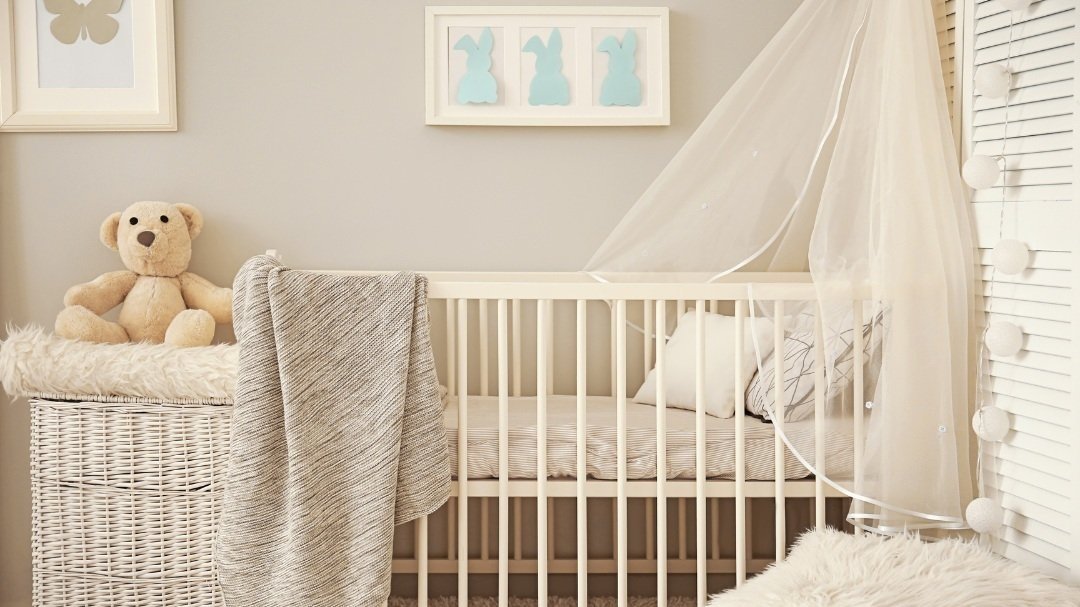
Cool beige baby’s room.
The trend has been moving away from gray to beige walls. There is another term that has come into use: greige, that quite accurately describes the bridge color, a gray/beige. These colors are really versatile for walls, because if you add warm colored furniture and accessories: such as gold, orange or wood; it makes greige appear browner, and the opposite is true: gray, blue or green furniture bring out the gray of greige.
The benefit of painting your walls neutral colors is their longevity. You can change up furniture, artwork, and accessories and the room looks new. Neutrals are relaxing and allow your furniture and artwork to shine. They work great if you want a monochromatic look, but add slight value and textural variations for interest. If you are leaning towards warm walls, here are some gorgeous warm neutrals to try.
Greige:
Pale Oak OC-20 Benjamin Moore. A light color with a balance of gray and beige.
Cedar Key OC-16 BM. Another popular greige with more color.
Taupe:
Pashmina AF-100 BM. The perfect pale taupe, with a balance of gray and brown.
Taos Taupe 2111-40 BM. A rich dark taupe, with a touch of green.
Beige:
Sonnet AF-55 BM. A rosy beige, soft and inviting.
Muslin OC-12 BM. A lovely warm envelope similar to muslin fabric.
Tan:
Lenox Tan HC-44 BM. A rich historic tan.
Coffeehouse Tan CW-130 BM. Another historic color exactly like coffee with cream.
Wishing you a colorful month. Contact me for help with your interior or exterior paint job color in Contra Costa, or Alameda counties. Please contact me through my website.
Kitchen Cabinet Colors you will Love
Suggestions for kitchen cabinet colors.
Gray Green Kitchen Cabinets
Whether to go with your passion, or to plan for longevity in your color choices is the question. Kitchen cabinetry gets a lot of service, and is one of the “permanent” features of your home. I put it in quotes because of course you can resurface or replace them entirely in the future, but at a lot of expense and inconvenience. We want to strike a balance between the desire for a unique, expressive kitchen and the desire to not become tired of it too soon.
Some version of white, bright or cream, is common for kitchens, and you may be very happy with it. The counters, and backsplash if you have one, affect the total look, and they are “permanent” too. Here are some whites for cabinets: a stone white, a slightly cream white, and a peach white.
Sea Pearl OC-19 Benjamin Moore, stone white
Simply White OC-117 BM, cream white
Pompeii OC-82, BM, slight peach white
Going with a bit more color in the neutral range, here are three colors with more umph.
Montgomery White OC-148, BM, like bisque pottery
Muslin AF-80, BM, a flat gray-beige
Greenmount Silk HC-3, BM, a slightly green-tinged cream
All of these colors still reflect a lot of light.
My last group of suggestions is blues and greens. Both of these colors in their endless choices go with the kitchen. Colors in the cool part of the color wheel, they are inherently fresh and a good backdrop for food preparation. One of the most inspiring kitchens I’ve seen recently is mint green; it was vintage, fresh and modern, all at once. My kitchen cabinets are a subtle blue-gray, similar to Blue Heather 1620 below. Here are some blues and greens that will make a beautiful color for your kitchen cabinets.
Blue Heather 1620, BM, gorgeous blue-gray periwinkle
Grand Rapids 835, BM, clean light blue
Wythe Blue HC-143, beautiful robin's egg blue-green
Burgess Green, CW-485, BM, part of the Colonial Williamsburg collection, plant-like green
Hint of Mint 505, BM, fresh clean mint
Maid of the Mist CC-728, calm gray-green
All of these colors are still light and will blend with other colors in the room for the counter and backsplash. Good luck with your kitchen project and let me know if I can help you. Contact me through my website contact page. www.beforeyoupaint.net
Note: Benjamin Moore paint is at the higher end for American paint companies, but their superior color designers and collections bring me back to it again and again. You can use their colors and have them matched in lower priced paint. Also, I can choose color from any paint company you prefer to work with.
Painted Floors and Floorcloths
Painting your floor color ideas and floorcloth history
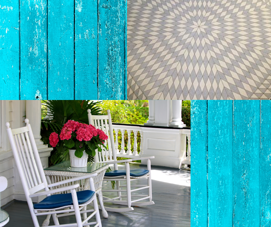
Painted porch floor and gray and cream vinyl floorcloth.
Painted Floors
A painted floor can be charming, an opportunity for color, and a relatively easy fix to hide damaged floors. In my last apartment before becoming a homeowner, the wood floors had dark water stains. The owner agreed to my painting them and I used a taupe, which was lovely and hid dirt.
Painting the floor is common for porches and cottages, where a cheerful dose of color is welcome on the floor. However, white painted floors are common in Scandinavia, where they have short daylight hours in winter, and want to maximize the amount of light.
In general, a darker, grounded color is best: barn red, medium to dark greens, and neutrals. Here are some I would use:
Benjamin Moore Cottage Red HC-184, a very dark barn red
BM Crownsville Gray HC-106, a medium/dark gray green
BM Coffeehouse Tan, CW-130, a nice mid-tone tan, like coffee with cream
The larger the floor area, the more you need a subtle, muddier color. A small area such as a porch can take something brighter.
Painted Floorcloths
Floorcloths were first created and used in 18th century England. They were made of an oiled or painted piece of canvas used for warmth, decoration, or used as a bottom layer to protect expensive carpets. Most modern floorcloths are made of heavy, unstretched canvas with two or more coats of gesso. They are then decoratively painted freehand or with stencils and varnished to make them waterproof.
A floorcloth is an opportunity to add pattern and color in a customizable color scheme that goes with your room. A company that makes a superb line of modern floorcloths in vinyl in a huge variety of patterns is Spicher and Company, available at cottagehomefurniture.com.
Wishing you a colorful month. Contact me for help with your interior or exterior paint job color in Contra Costa, or Alameda counties. Please contact me through my website: www.beforeyoupaint.net
Keep your Wood Natural or Paint it?
When homeowners move into a new house, they may have paneling, a fireplace surround, beams, or built-in cabinets in wood and may not know whether to keep it in its original wood state or paint it. The answer is: it is entirely subjective.
Today, most people want a light, bright home. To get it, they use white on the walls, and optimize light from windows and with lighting. Even if the woodwork is exquisitely made from the last century, if there is an abundance of it, it still can absorb all the light in a room. If this is not the atmosphere you want, paint it. You can paint part of it, and keep highlights, such as painting all the paneling and walls light, and keep the fireplace surround or beams in their original wood.
The texture of wood is a grounding influence every room needs; it reminds us of nature. The patina of old wood is even better: an old chair, sideboard or table; then you have soul and history. There is an attitude among some that wood is sacred as is and should not be painted, that extends from built-ins to furniture pieces. I think you can create the aesthetic you want for your room.
The answer to the dilemma is balance. Balance some natural wood with painted elements, and balance the mid-tone, light and dark colors in a room. If your walls are a light neutral, you can afford to have a few dark pieces in a rug or piece of furniture and some very light elements in window coverings or furnishings. And mid-tones, colors with a Light Reflectance Value of around 50, are helpful to balance the room.
I help people with their color choices for paint jobs in northern California, Contra Costa and Alameda counties. Contact me through my website Contact page.
Periwinkle and Cornflower
Periwinkle and Cornflower cheerful energizing airy
Periwinkle hydrangea, bench, bird
These color names are interchangeable, both referring to a blue-purple mix. There are some that lean more blue and some more lavender and more subdued grayed versions. In the language of flowers, Periwinkles carry the symbolic meaning of faith, trust, and lasting love. In folklore, Cornflowers, or Bachelors Buttons, were worn by young men in love; if the flower faded too quickly, it was taken as a sign that the man's love was not returned. Hydrangeas too come in a periwinkle range of colors.
If it is bright, periwinkle is cheerful and youthful and works well for a boy’s or girl’s room or the front door. If it is softer and paler, it is ephemeral and airy and can work for a kitchen or bedroom. If it is grayed, it feels laid back and soothing as a bedroom or living room.
French Provencal fabrics have time-honored color combinations that use all colors, but I especially love the periwinkle/yellow combinations.
See below for a range of periwinkle paint colors to use in your decor. I’ve included the Light Reflectance Value (LRV). The range is 0-100, with 100 reflecting all the light available.
Benjamin Moore, Blue Ice 821, LRV 59. A very pale periwinkle blue for a ceiling or child’s room.
Behr Simply Blue PPU 15-16, LRV 49. A mid-range value that leans blue with a nice amount of gray. Great for a bedroom.
Ralph Lauren Veranda Iris CO18A, LRV 38. A beautiful blue-grayed version like the AirMail paper of the past.
Benjamin Moore California Lilac 2068-40, LRV 27. A bright version with equal parts purple and blue, great for a front door, or a piece of furniture.
Farrow and Ball Bothy Blue G11, LRV 23. A dark subdued periwinkle.
I do color consulting for paint jobs in Contra Costa and Alameda counties in northern California. Contact me through my website if you need help. https://www.beforeyoupaint.net
Choosing an Exterior Paint Color
Natural Surroundings, Vegetation, Hillsides, driveway, roof color
Painting the exterior of your house is a big ticket item, so there is every reason to choose conservatively, so you will continue to enjoy it for 10 years or more. Paint companies have upped their game, and paint lasts longer than it used to. Here are my main considerations when helping a client choose exterior color.
Natural Surroundings, Vegetation, Hillsides
Do you have distinct vegetation that enhances the house that you will be keeping, such as trees, shrubs or hills (can’t be moved!). Also, is your house shaded by trees? or always in bright sunlight? Near a body of water?
Neighboring Houses and Structures
An English architect-designed home show I’ve watched used an old train station as part of the view and “borrowed” the color for the house trim. It was very subtlely harmonious. Similarly, consider your neighbors house colors. You don’t want to match your neighbors, but you can stand out by using a different version of a color you like. For instance, khaki, it’s a great environmental color, since it contains green, which goes with vegetation, and brown, which goes with earth, but there are endless variations of it.
Existing Colors in the House Structure
Roof, brick or stone siding you don’t want to paint, driveway, fencing, walkway: All of these elements have color, and the house colors can and should harmonize with them, either through contrast or analogous color. If you have a terra cotta roof, let's use that color somewhere in our paint scheme.
Simplify Trim Embellishment
The modern convention which I prefer is to simplify the trim colors of the house, even on a very large house. This creates more impact, and is restful to the eye.
Good luck with your exterior color, and contact me if you need help in Contra Costa or Alameda counties in the San Francisco Bay Area.
How to Handle your Trim Color
There are many ways to paint interior trim. For many years the convention has been to use a white that complements your wall color and use it throughout the house so there is visual continuity. Read below for some new ideas on this subject.
Use Warm Trim for Cool Walls and Vice-Versa
I like to use a warm color if the majority of your wall colors are cool and a cool color if wall colors are warm. Never underestimate the ability of warm and cool colors to amplify each other. Although, in general I favor warm colors to live with. However, since this will be a throughline in the house, it is best to love the color! It will be thematic for the home, your identity for a while.
Combine Wall and Trim Colors
Combine baseboards and crown molding (if you have it) with the wall color. A YouTuber I follow did this in a 1000 sq. ft. northwest cottage to great effect. By simplifying the trim it reads as less busy and more expansive. You will still need to break up the wall color with some contrast trim, such as doors, and door and window casings.
Pick a Darker Trim Color
Another idea is to go darker with the trim. I plan to do this in my upcoming paint job in my living and dining rooms for all trim and doors, and eventually throughout the house. I’m in love with some murky colors like Sherwin Williams Lambs Ear (LRV 50) and Benjamin Moore (BM) Hazy Skies (LRV 58) or even BM Lenox Tan (LRV 43). LRV is light reflectance value, with 50 reflecting half of available light; a high value is a lighter color. I’ll have a very light wall color, probably BM Pale Oak (LRV 68).
That brings us to ceilings. There are many interesting ways to handle the ceiling than using white. More on this in a future blog. Contact me for help with your paint job in the California counties of Contra Costa or Alameda.
www.beforeyoupaint.net, 925-222-1145 - please text first to avoid spam
What Wall Color Complements my Artwork?
People ask me: What wall color will go with my framed artwork?
Multi-colored Artwork
If you have naturescapes that are multi-colored, with blue, green and brown, or include flowers, whatever color you choose to paint the walls will pull out the corresponding color in the painting. I would add clothed figurative paintings to this too because they can have any color in the clothing or background. Any neutral greige, beige, gray, light blue, sage, subtle pink or cream works.
Don’t Match A Painting to Furniture
There is no reason to buy a painting to match furniture; it looks too safe and boring. Choose paintings you love and hang them according to the size of the wall or furniture they will live above, with the center of the painting at eye level for most occupants.
Unify Frame or Mat Colors
A good strategy is to unify all the frames in the room in one color, all gold, black or white. This links them visually. Likewise, using the same color mat will unify an arrangement of artwork.
Special Paintings
If you have a very special portrait or painting hang it on a wall that is about a foot wider than the frame or on the chimney piece. This adds a second frame and draws the eye to it.
Art Collections
These tips are for most people who have a few pieces of artwork throughout the house. If collecting artwork is your life’s work, then white walls are the backdrop to go with, the art gallery look, with key pieces lit well.
I hope this helps you create a harmonious room with interesting wall color and framed artwork by unifying frame or mat colors, complementing your furniture arrangement, and adding good lighting.
Pamela Fox is a color consultant serving Contra Costa and Alameda Counties in the San Francisco Bay Area. Contact me for help with your interior or exterior paint job. www/beforeyoupaint.net, 925-222-1145.
Ideas for Painting Your Front Door
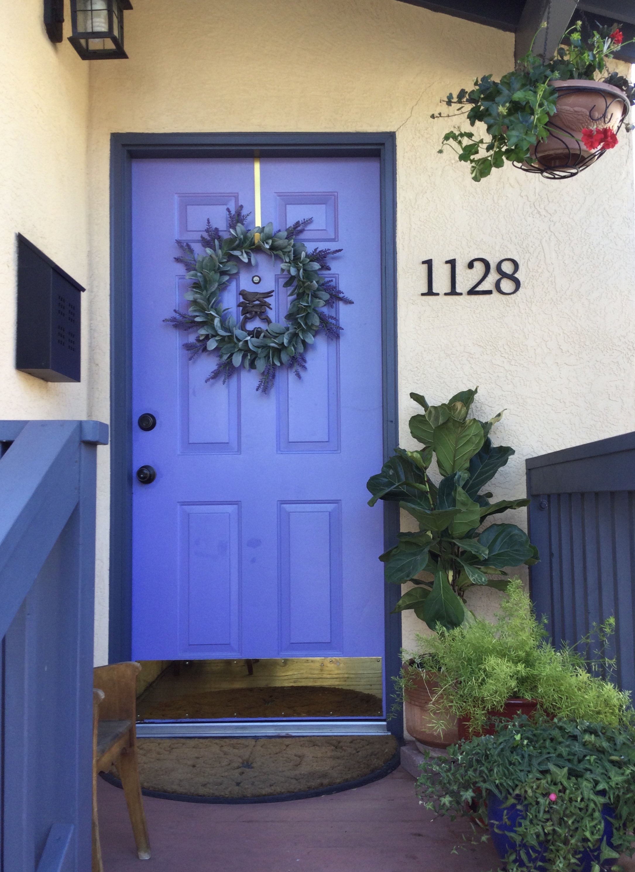
California Lilac 2068-40 Benjamin Moore. Color by Before You Paint.
Your front door and entryway are the focal point of your home. First and foremost, the color needs to complement the other colors of your house, and work well as a standalone color. I like to think of it as the signature color of the homeowners. Here are some ideas on front door colors.
Use Your Signature Color
Is there a color that you consistently identify with, that fits your energy as a person? For me, it’s periwinkle, and my front door is in the picture above. The house is Crisp Straw, the trim, Evening Dove, and the door, California Lilac 2068-40, all by Benjamin Moore (BM).
Use A Very Pale Color
Using a very pale color is unusual and creates a delicate, romantic feel to the house. Pale pink, Cashmere Wrap CSP-345 (BM), pale blue, Marilyn’s Dress 2125-60 (BM), pale yellow, Cream 2159-60 (BM).
The Element of Surprise
The front door has a small surface area, so you can go bold, as long as it complements the other colors of the house. Raspberry such as Raspberry Pudding 110B-7 Behr (BR), electric blue, Dynamic Blue SW6958 Sherwin Williams (SW), lime green, Electric Lime SW6921 (SW), or carrot orange, Orange Nectar 2013-20 (BM).
Tradition
Traditional colors may be the thing your house needs, and what pleases you most. Black, lacquer red, Vermilion DEFD22 Dunn Edwards (DE), white, or deep navy, Dark Navy S530-7 (BR), forest green, Malachite Green DEFD37 (DE) or deep plum, Plum Raisin 120F-7 (BR).
I hope this inspires you to consider your signature color, go bold and create a real focal point you will enjoy every time you enter your door.
Pamela Fox is a color consultant serving Contra Costa and Alameda Counties in the San Francisco Bay Area. Contact me for help with your interior or exterior paint job. www/beforeyoupaint.net, 925-222-1145.
