Using the Seventy-Twenty-Ten Rule with Color
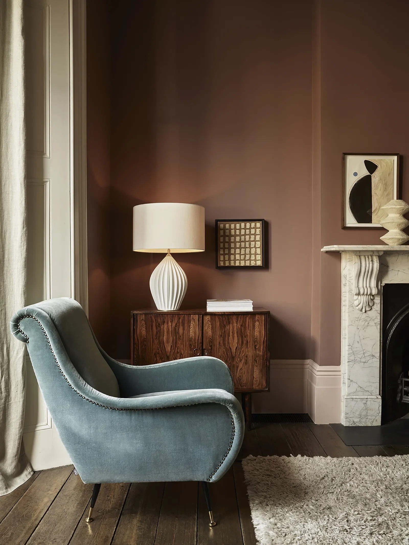
Brownish-Rose walls with Neutral Curtains and Rug.
I love color and in some arenas like creating fine art, I can go all in and out the other side. But to create a space that I find relaxing and nurturing, it needs to be serene and also interesting.
There is a concept in interior design of balancing called the 70-20-10 rule. Here it is:
Use 70% of one color in a neutral: white or warm earthier colors, for the walls and ceilings. This creates a grounding relaxing envelope that is expansive too.
Use 20% of another color for rugs and draperies or blinds. This could be a subtle difference, such as rose beige curtains with tan walls, or a contrast such as pale taupe walls and green rugs and draperies.
Then use 10% of an unexpected color for accessories: pillows, light fixtures, ottoman, decor objects and artwork. This has to be an intuitive choice, but unexpected is best: acid green, lavendar, lemon yellow, gold.
Here are some really great 70% colors I’ve worked with.
Benjamin Moore Edgecomb Gray. It's a beautiful greige that is expansive and enveloping. Looks good with many other colors including blues.
Benjamin Moore Tudor Cream. For an uplifting youthful color similar to French Vanilla ice cream, you will love this. Looks great with cool colors for a complementary contrast.
Farrow and Ball Sulking Room Pink. This is hovering between brown and rose, an amazing moody color. The supporting colors can be taupe, chocolate brown.
Farrow and Ball French Gray. Closer to a green, this works on a whole room.
Sherwin Williams Alabaster. A tried and true not too warm, not too cool white.
Sherwin Williams Universal Khaki. A wonderful color that can be used in any room. Adaptable, warm and easy to live with.
If you need help with choosing color for your interior or exterior paint job contact me through my website contact page or text 925-222-1145.